My News App Idea
It won’t be long before we are reading our news on tablets much bigger than 11 inches. They will be thin, light and quite likely bendy for those that want to roll it up (like a newspaper!)
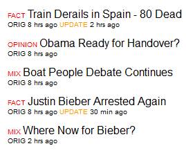
I would like an app that takes up the full screen, with a column down the left that shows the headlines:
Of course colours can be changed, and the headlines could be longer, or have a second line of info.
Above the headlines would be a dropdown box for selecting the category of news (or all) I want to read.
To the right, when you click on the headline, will be a paragraph or dot point summary of the news item – along with one pic if there is one. For me that would be sufficient most of the time:
- Weighs 4.3 kilos at birth
- Kate is well
- Name is yet to be announced
- Still in hospital
- England is celebrating
And below that would be a button to click on for the full story. That story would take up the entire screen. Swipe it to go back to the headlines and summary.
I think it is obvious that, for me, knowing if a story is factual or not (or a mix) is important. As well as knowing how old the story is, and if the headline is referring to an update to an ongoing story.
Behind the scenes I would like to rule out types of stories that I don’t want to read. For example, some I would choose:
- Car fatalities involving less than 5 people
- Third-world tragedies where less than 200 people die or 1000 are directly affected
- Political opinion pieces
- Funerals
- Somebody is about to go to trial
- Jury is deliberating
